UX Research
Information Architecture
Visual Design
UX Strategy
Interaction Design
My Role
UX Researcher
Information Architect
Interaction Designer
Visual Designer
Duration
1 Year
Team members
1 Product Designer
1 Tech Lead
2 Developers
Industry
Saas
B2B


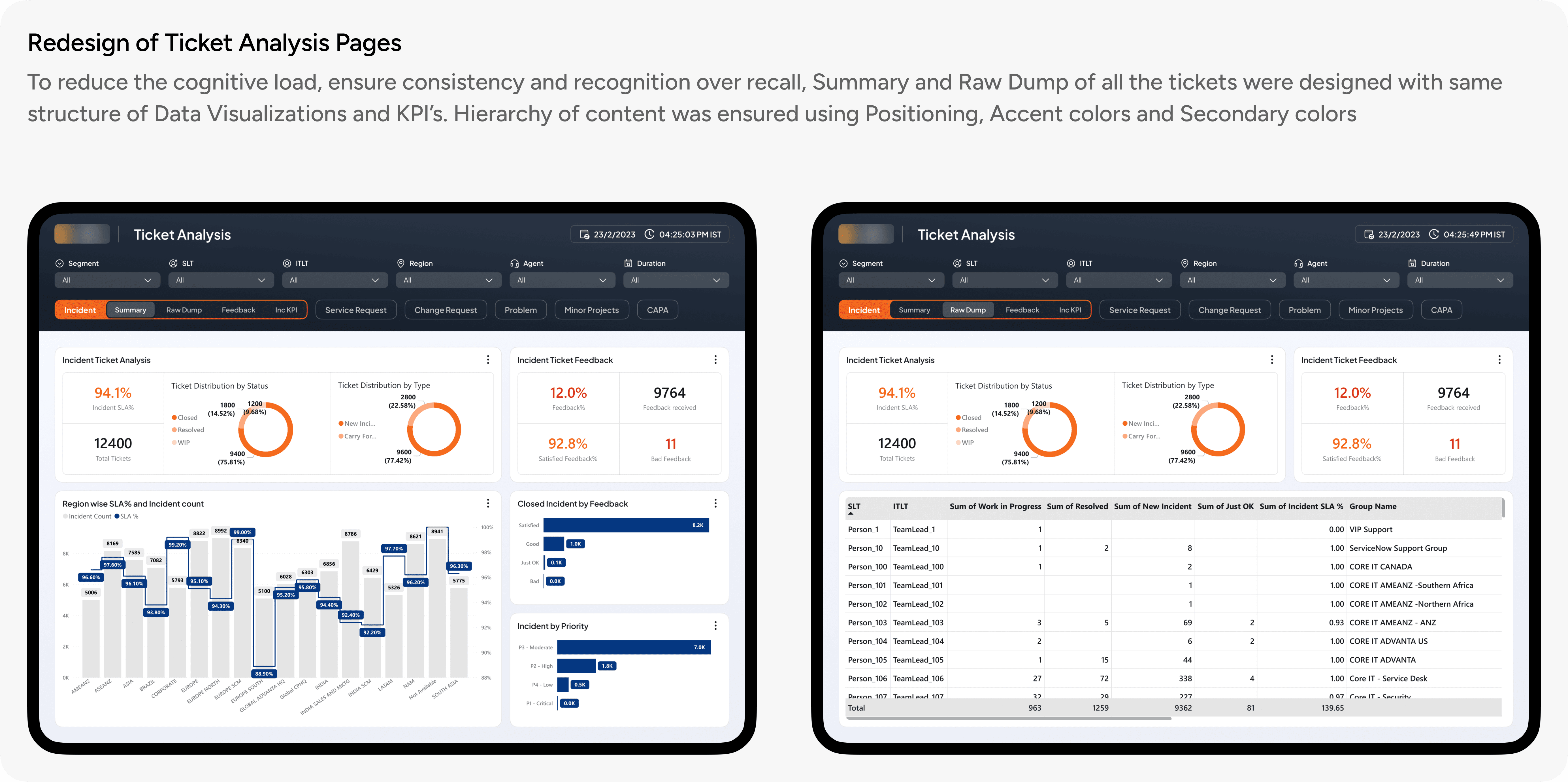
Color system was aligned to the brand guidelines of client along with new hierarchy, layout and typefaces.

User research and its analysis led to a common framework followed by educators. This framework was used as a guiding point to strategize the exams
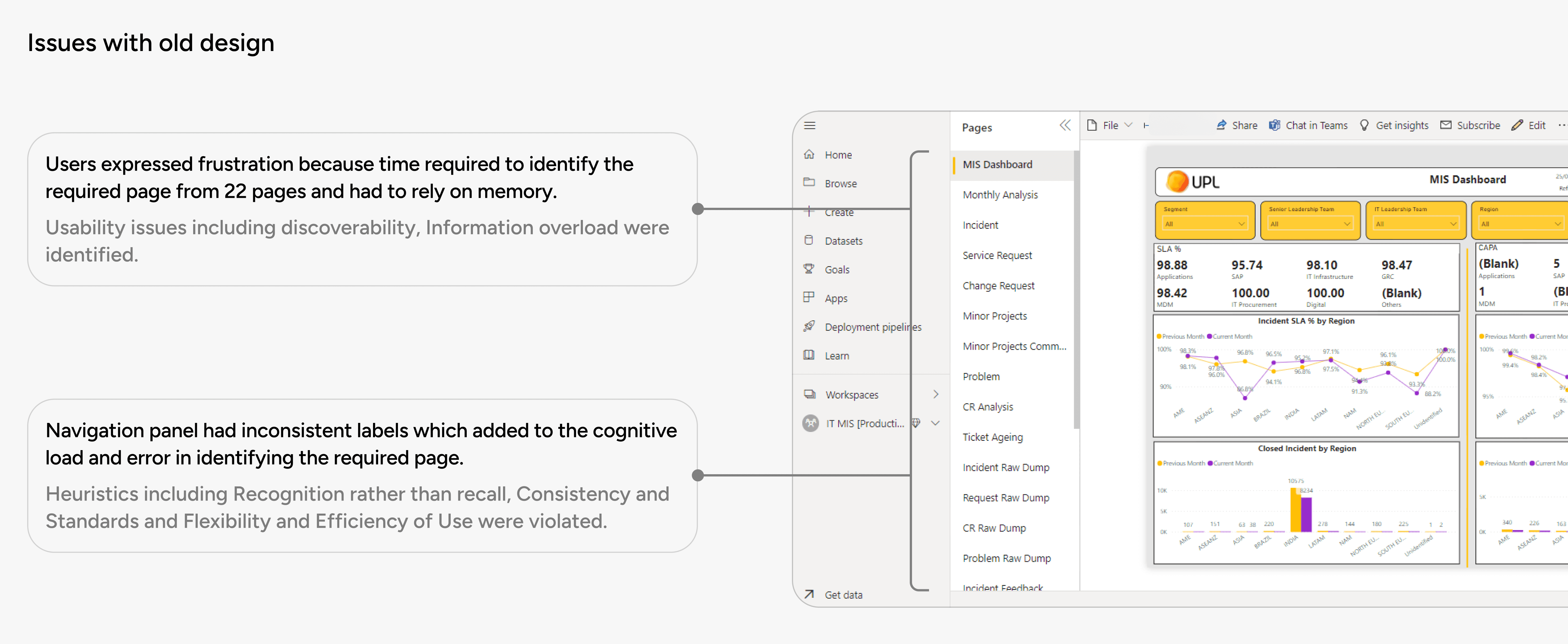
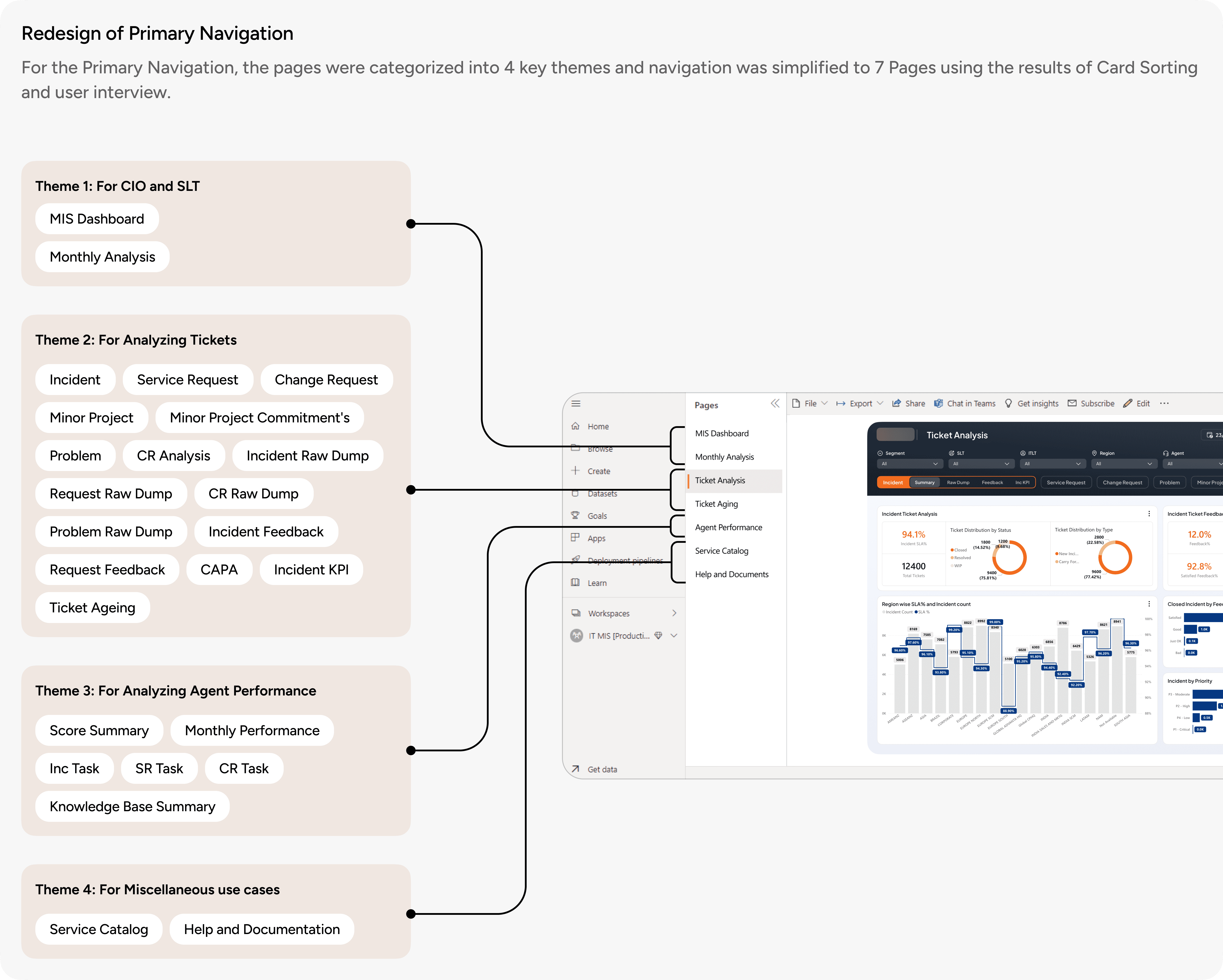


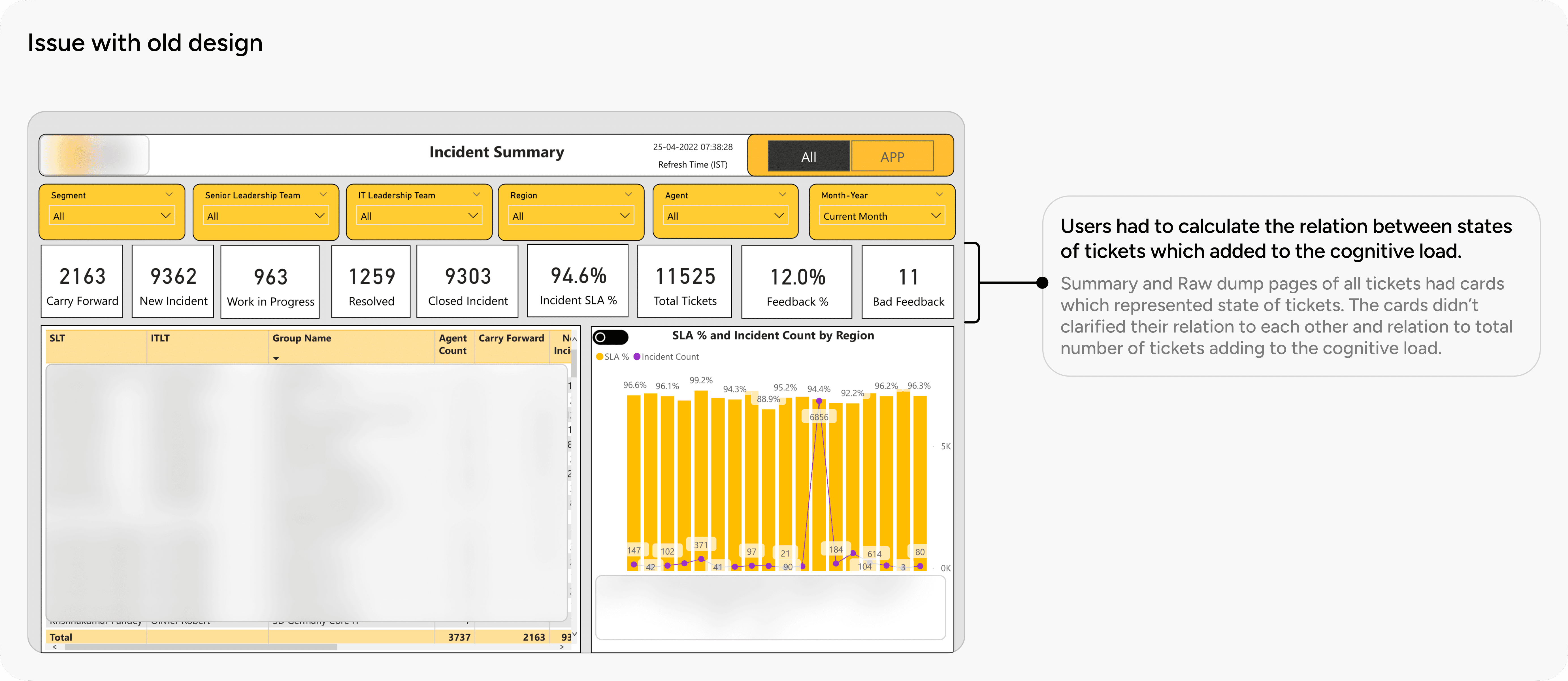
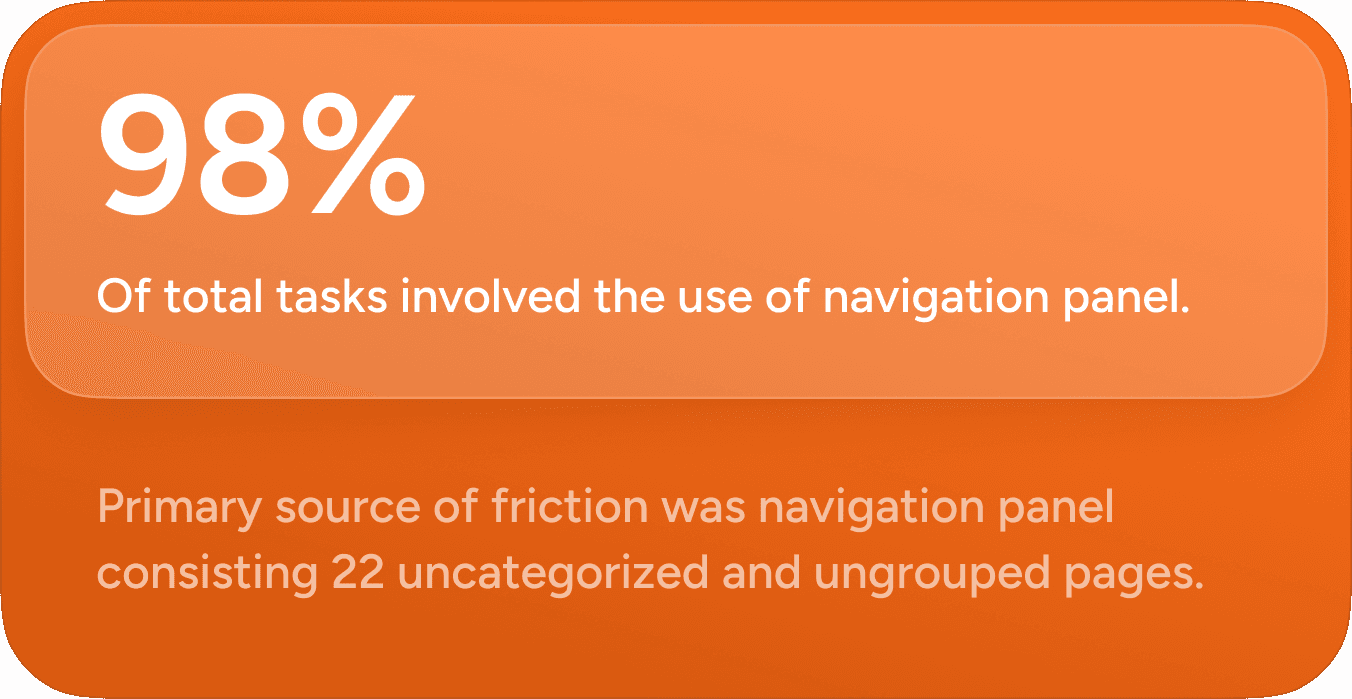
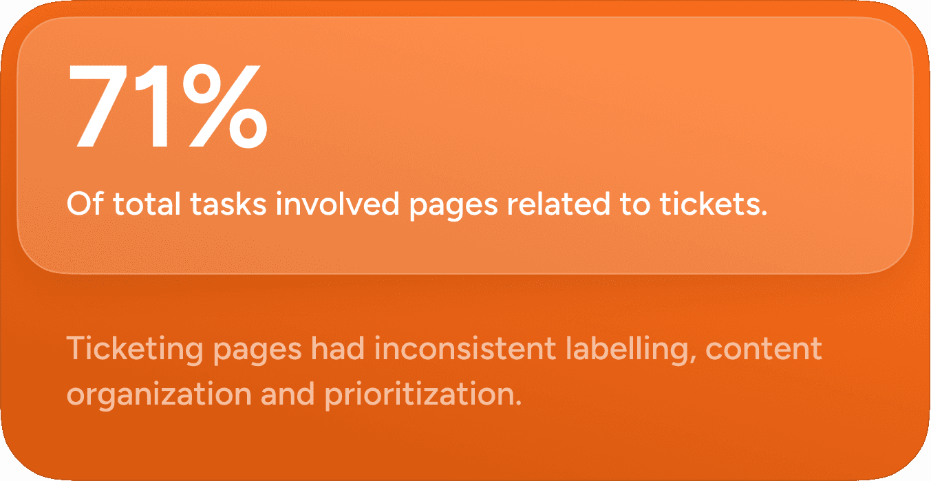
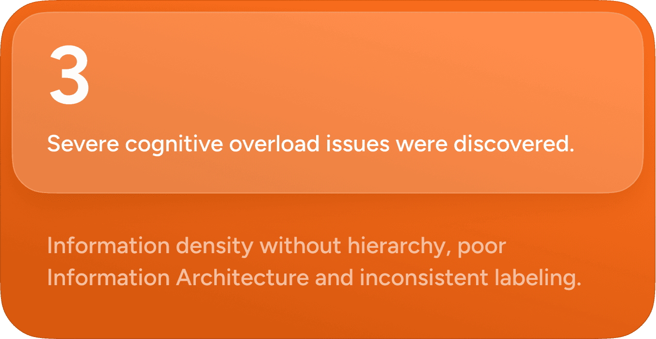
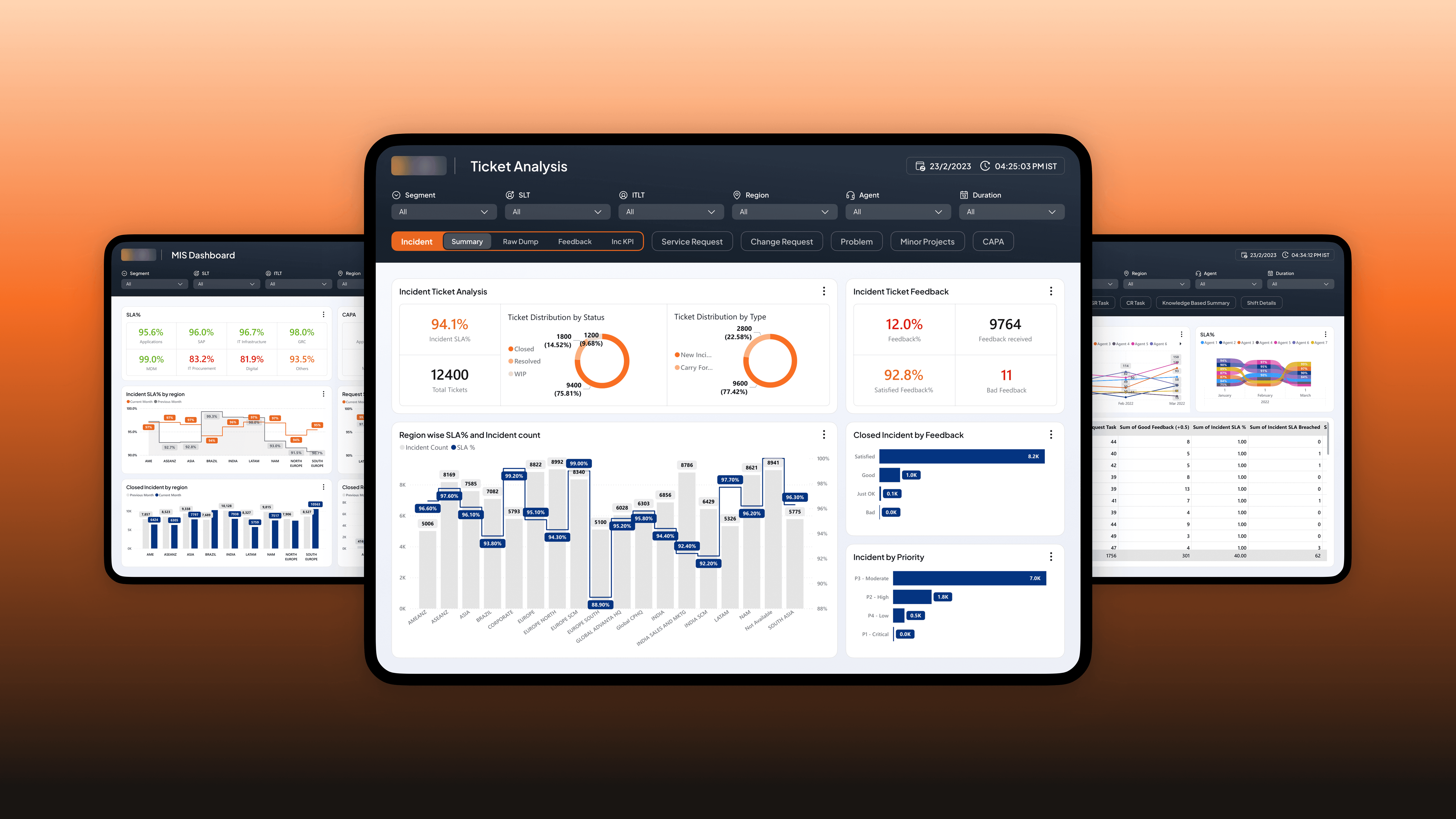
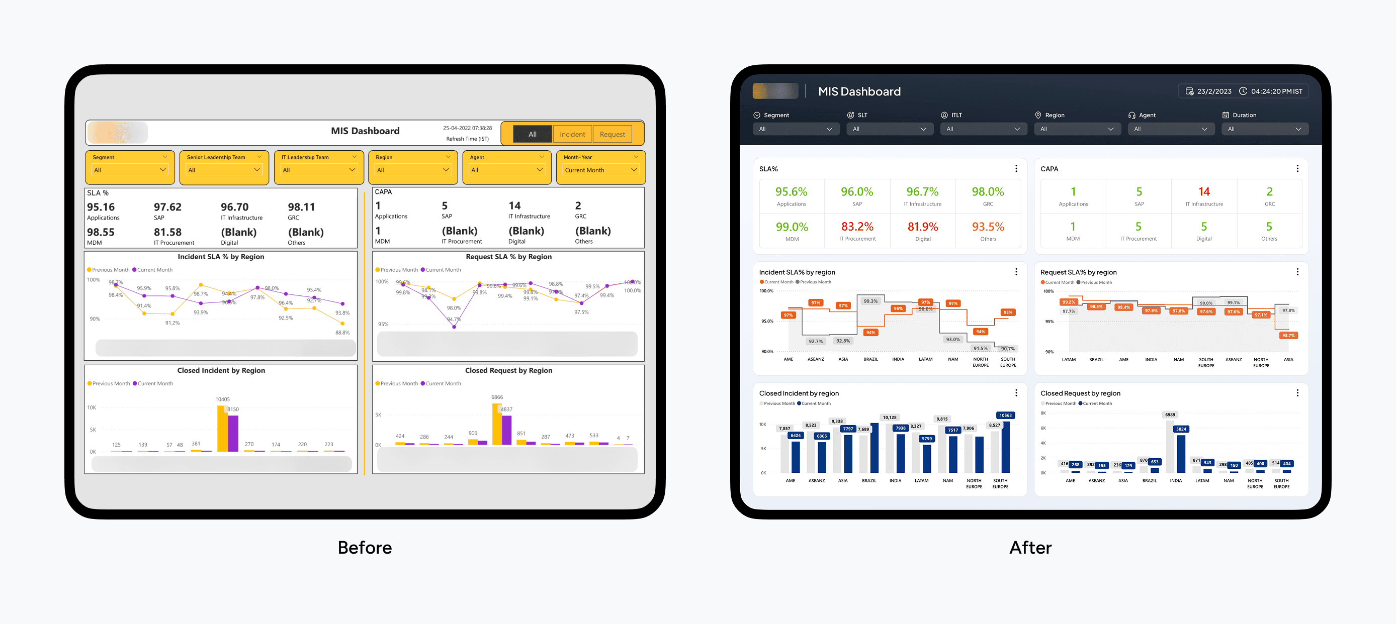
The critical part of cognitive overload was navigation panel which was simplified into Primary and Secondary navigation using progressive disclosure. Another challenge was introducing hierarchy in content organization and consistency across various pages which is explained below.